Monday, April 28, 2008
ECON 365: What if economic growth had been distributed more eqaully?
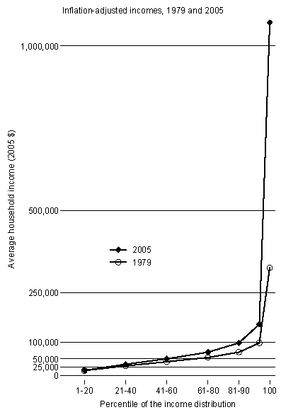
Income inequality in the U.S. has increased sharply in the past generation. Those who worry about this development do so partly on grounds of fairness and partly because inequality may have adverse effects on politics, health, and crime. Sometimes overlooked is a more immediate cost: slow income growth for a large chunk of the population.Just so the numbers are little more clear. A household in the second quintile was (eyeballing the graph) making approximately $26,000 in 1979. In 2005, second quintile households were making a little over $30,000, but if incomes had grown by 1.5% (annually) throughout the distribution second quintile households would be making over $38,000 in 2005.The following chart shows average inflation-adjusted incomes in 1979 and 2005 for various groups of households: the bottom 20%, the lower-middle 20%, the middle 20%, the upper-middle 20%, the next 10%, the next 9%, and the top 1%. The incomes include government transfers and subtract taxes. The data, from the Congressional Budget Office (here), are the best available for this purpose.
The average income among all households rose at a rate of 1.5% per year over these two and a half decades. But as the chart makes plain, much of that increase went to households at the top of the distribution, especially those at the very top. Households in the bottom three quintiles experienced very slow income growth — 0.2% per year for the poorest quintile, 0.6% for the next, and 0.7% for the middle.
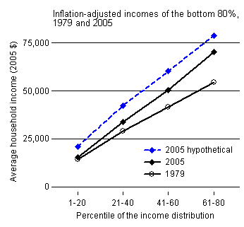
What would 2005 incomes have looked like if income growth had been proportionate rather than heavily skewed in favor of the top — in other words, if all incomes had increased at a pace of 1.5% per year? The dashed line in the next chart shows the answer. To make it easier to see the effect, I include only the bottom 80% of households here. All of them would have been a good bit better off.
It’s often said that progressives focus too much on the distribution of income and don’t pay enough attention to absolute income levels. In fact, its impact on absolute incomes is one of the chief reasons to be concerned about rising inequality.
![]()
Subscribe to Posts [Atom]